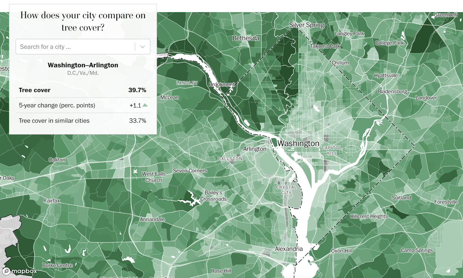
Which U.S. cities have the most trees?
2025Data highlights
- Matched U.S. cities to peer cities based on geographical proximity, climate and population density
- Investigated policies and practices in outlier cities where tree cover is much higher or lower than expected
Visual highlights
- Interactive lookup tool (mapbox-gl-js) for neighbourhood-level data
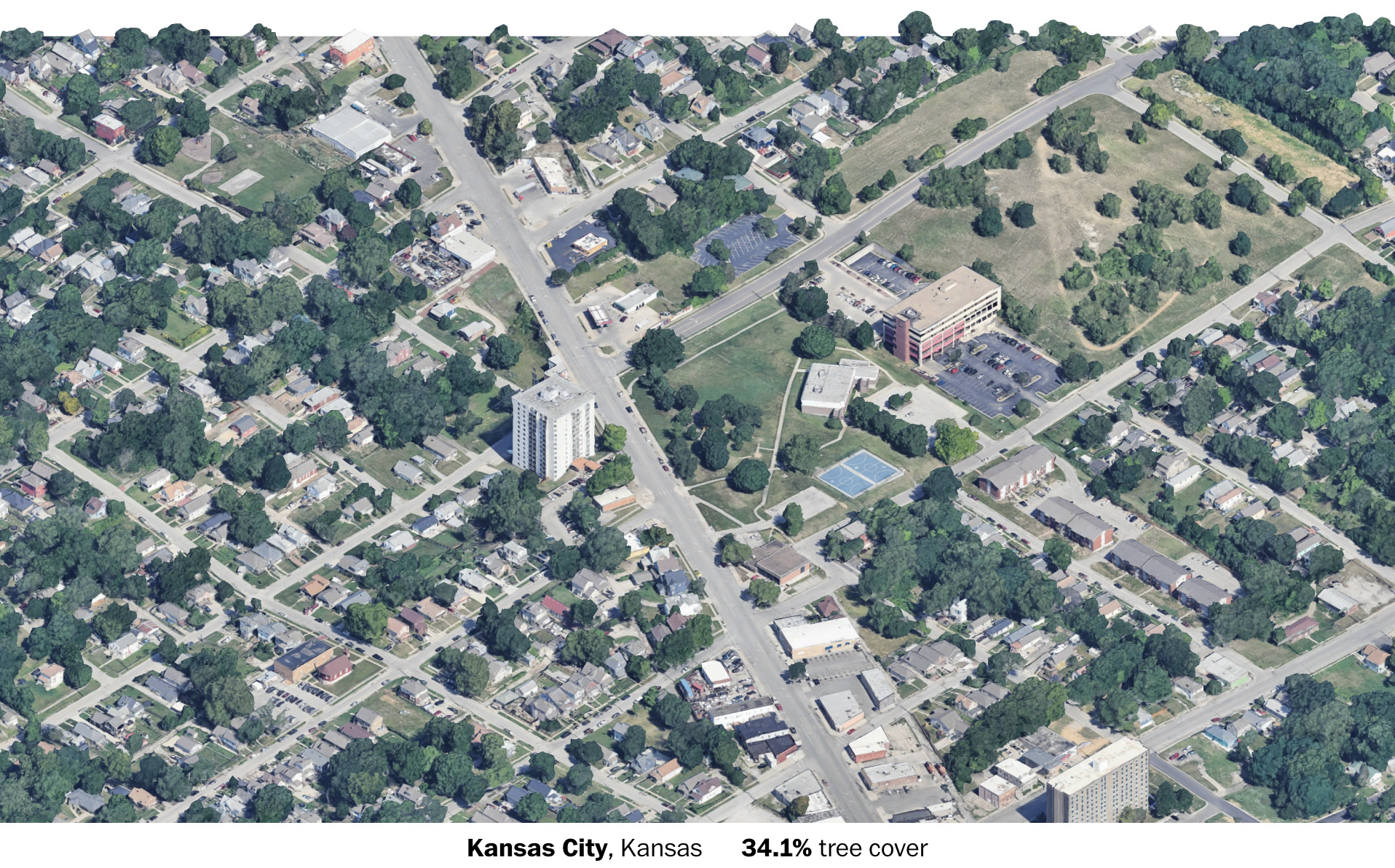
- SimCity-style isometric views of example cities from Google Earth Studio